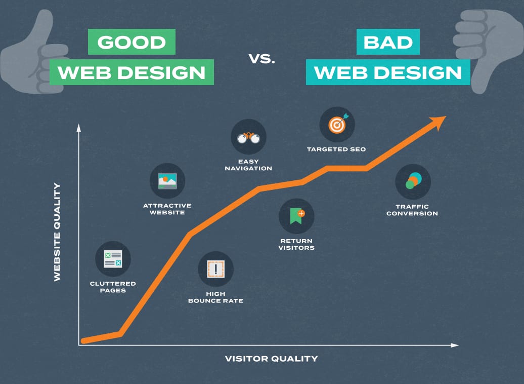
Everybody loves their website. For most of us, our website is kind of like our child. No matter what they do, we continue to love them unconditionally. However, we need to take a step back, take a long look, and consider the fact that we could be wrong. Your baby might be ugly.
Baton Rouge Web Design and Marketing
It’s an idea that has been circulating the Internets and conferences for a few years. This 2008 article calls your baby ugly. Though he writes about landing pages, the concept applies to web design in general.
Quality Over Quantity
Often, people think their website needs MORE traffic. That might be true, but before you dive in, take some time to analyze the traffic you DO have. Is it performing optimally? Do visitors stay on your site, click around, and convert? If not, additional traffic is only going to do the same thing, which leads to nothing.
Look For The Signs
Here are four sure signs your web design is hurting your online marketing efforts:
1. Your traffic is leaving immediately after hitting your website.
Bounce rate is an excellent indicator of website performance. Do visitors come to your site and immediately clicking the back button? These actions will reflect in your bounce rate. You can find this number in your site’s analytics (you ARE using analytics, right?). What’s a high bounce rate? It can vary depending on many factors, but if more than 50% of your visitors leave right away, it’s time to get to work!
2. People are clicking the wrong things when they come to your website.
A good design will lead your visitors to move deeper into your website. They’ll be encouraged to take actions that eventually convert them into customers. If people are clicking to the wrong pages, or click things irrelevant things, it’s time to get to work! (Start with evaluating why you might have irrelevant things on your site in the first place!)
3. Your traffic is not converting.
There should be something you ultimately want your visitors to do on your website. Buy a product, schedule an appointment, or contact you. If people are not taking this action at a rate you want them to, you need to figure out why.
4. Someone tells you it’s ugly. Here’s the thing.
Here’s the thing. People, for the most part, are not going to go out of their way to be mean to your baby. If someone is telling you your website is ugly—even if you disagree—try to take a step back and re-evaluate. Get a second opinion, just not from your mother or best friend.
Glow Up With Gatorworks
We know it can be challenging to take a critical look at something you love. But reevaluating your website is of the most important things you can do for your business. Do one or more of the above signs apply to your baby? Do you think you could use a little bit of help? Gatorworks could be the answer. We design dozens of high-performing, beautiful websites every year. Yours could be next! Reach out or give us a call at 225-924-6109.