With a recent name change, Forum225 (previously Forum 35) came to Gatorworks in search of a new logo and brand identity. This community organization needed an update to unite the city and make members proud to represent the 225.
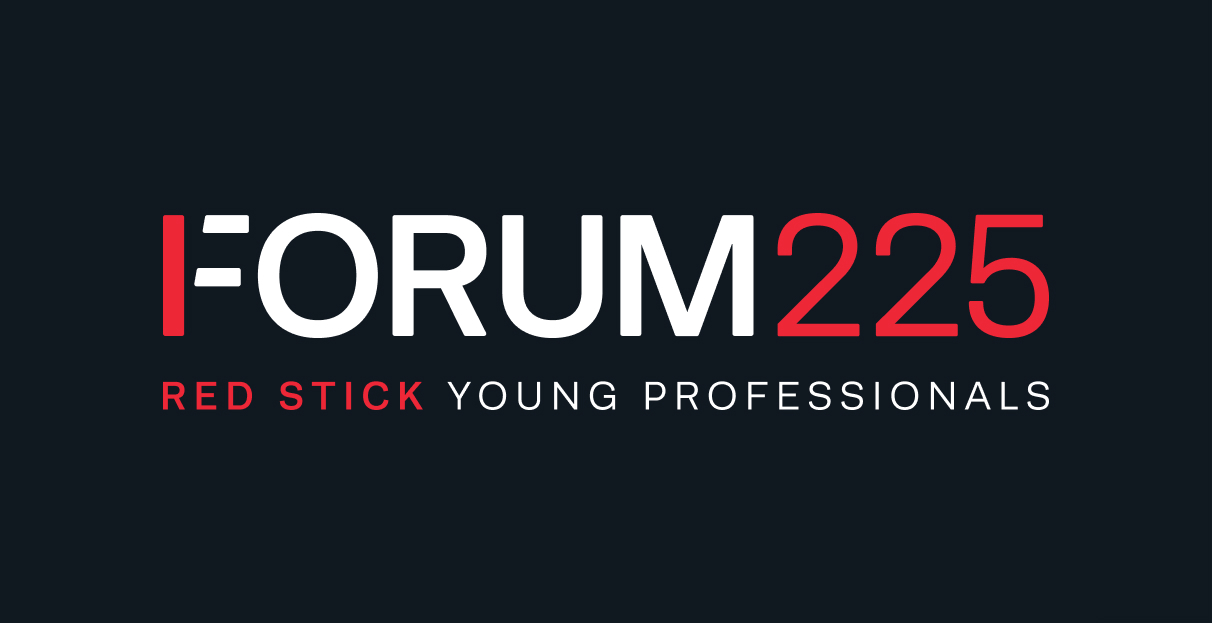
Founded in 1993, Forum35 was designed to provide leadership opportunities for the next generation of Baton Rouge’s leaders. Nearly thirty years later, it still stands as a thriving community organization with the same mission to improve Baton Rouge. With a new name like Forum225, we knew this had to be a logo that beamed with pride for the Capital city.
A New Look
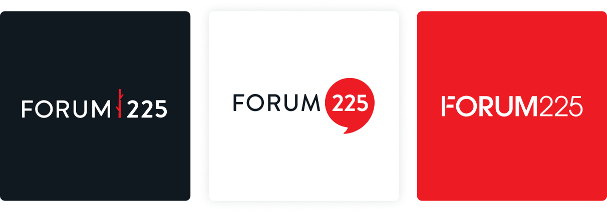
To start off, we met with Forum’s president and discussed the origin of the new name and what this would mean to the organization moving forward. We aimed to learn more about Forum’s services, projects, members, culture, and even previous logos and the story behind them. After exploring various logos, we created 3 different versions for the board to vote on. Each version embodied a piece of Forum’s history with a nod to its bright future. The finished product was a clean, and modern logo that exemplifies the professionalism and culture associated with Forum225 while showcasing its red stick history.
Key Features
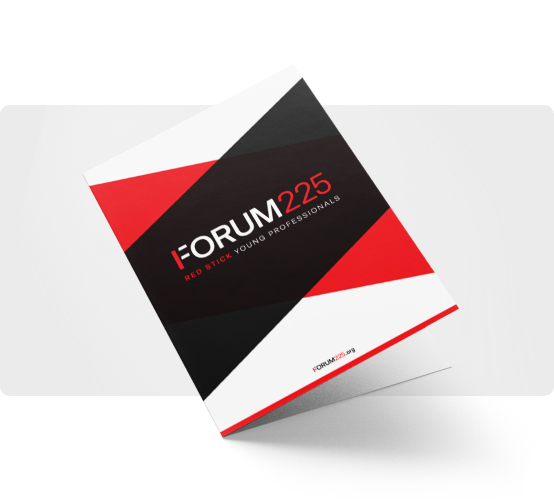
When putting on events or communicating with other professional entities, it’s helpful for the members and leaders of Forum225 to be able to use documents that represent their new brand. We formatted thank you cards and letterheads to include the new logo and color palette.
PowerPoint Theme
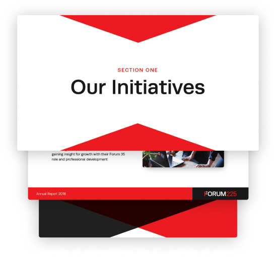
The cover slide of this presentation displays the new Forum225 logo centered between shades of red, black and white. Options for content slides include one with a solid red line with a mini version of the logo in the footer or slides with vertical red or black triangles for slides that need a little more pop!
Summary
Forum225 came to Gatorworks with the opportunity to take something that has been around for years in Baton Rouge and make it new again. With a new name, new logo and new business collateral to match, Forum225 can truly embody their mission to create opportunities for all young professionals and move our city forward.