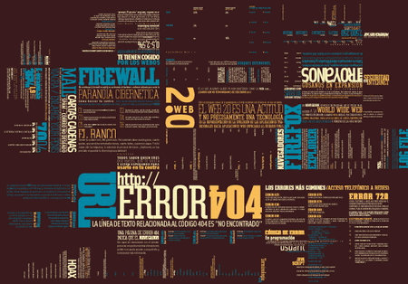
Welcome to the inaugural post of Typography Wins and Fails. Our purpose here isn’t to bash every use of bad typography we find, but to simply bring to light the frequency of common errors and the good examples of typography in modern media.
My favorite example, Trajan Pro a typeface designed to resemble the lettering on Trajan’s Arch in Rome. This font has been used and overused, and thus one part of this typography article is a focus on Trajan. Alas, Trajan has become a staple in certain industries and thus has earned a a bit of infamy. Namely, it’s commonly known as the “Movie Poster Font” but I have seen it in areas like bus stops, hospitals, real estate floor plans, and many other things.

My friends’ and my attempts to show the people common mistakes in typography such as distorting text, hatch marks, and terrible kerning will be documented here along with examples of typography in it’s best form. The focus of this article will shared between good and bad uses of typography.
Hopefully, through this article we can enlighten people about what’s wrong with common uses of typography and have a little fun while doing it.
Typography –when done right– can be beautiful and communicate a strong message. However, when the concept of typography is brandished wildly like a weapon without cause or understanding ends up being a detriment to the overall purpose of the user.
“Most people think typography is about fonts.
Most designers think typography is about fonts.
Typography is more than that, it’s expressing language through type.
Placement, composition, typechoice. ” -Mark Boulton
That being said, we’re going to look at the way a message is conveyed through the application of type effects, colors, placement; while also critiquing the composition as a whole in the near future.
-Chase